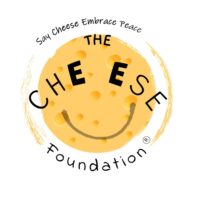

Why is The Cheese Foundation’s logo yellow in color?
Colors are one of the most powerful tools in influencing one’s psyche and mood. Did you know? Psychologists say we choose our clothes and outfit for the day based on the mood with which we woke up!
The color yellow is associated with happiness and warmth. Imagine standing amidst a beautiful sunflower field, with the rays of the sun kissing your cheek and lovely butterflies and honey bees bustling around you in the warm sunshine. Already feeling relaxed, warm and blissful right?
Through the varied activities of The Cheese Foundation, we aim at bringing a smile on ‘someone’s’ face; give them the warm experience of bliss and mirth. The happy curve on the logo, is a representation of what we want to give away to this humane world, we all belong to.
PS: Our logo was designed by Mr Nitish Shiggaon.
Take a look at his Instagram profile artofnitish to find his art work.
Say Cheese, Embrace Peace 🙂
Our Logo was launched virtually over Instagram live by Mr Pavan Venugopal, standup comedian, YouTube.